Wonders Of The World


Something I spotted whilst flicking through Vogue recently.
Ever wondered what happens to a stuffed tiger once photographed in a Mcqueen shoot or maybe even  a discarded parasol umbrella from Christian Dior...well look no further than SHOW STUDIO.  SHOWstudio is an online broadcasting company that is committed to pioneering live fashion media through experimental interactive porjects, films and performance.

The studio is headed by photographer Nick Knight and since 2000 has worked with top fashion industry figures from Kate Moss to Agyness Deyn. With a keen interest in investigating the potential of motion imagery, interactivity and image making, SHOW aims to transform fashion editorial with fresh ideas. This, alongside industry collaborations has allowed SHOW to offer a rare and  'insider' view of the high end fashion world, updated 24 hours a day.

Projects include:
'Sleep', the first webcast featuring models sleeping. 2001
‘Bring & Buy’ project in collaboration with i-D magazine raises £19,200 for Oxfam. 2003
24HRS’, a twenty-four hour live fashion broadcast in collaboration with Yves Saint Laurent. 2006

Nick Knight describes his brainchild as:
"…  the belief that showing the entire creative process—from conception to completion—is beneficial for the artist, the audience and the art itself.”

Visit http://shop.showstudio.com/index.php if you feel like purchasing something out of the ordinary, there are a few weird and wonderful props on offer. Perhaps a giant poodle puppet from Vogue for £6,000!

Classified: Tate Britain


"There is something at once uplifting and terrifying about the idea that  nothing in the world is so unique it cant be entered on a list"  (Georges Perec 1936-1982)

On a recent visit to the Tate Britain, I had a chance to explore one of their contemporary exhibitions entitled: Classified. The idea surrounding the exhibition looks at how we interpret and view things in our everyday lives. 

Some of my favourite pieces were:
'The Great Bear' Simon Patterson, 1992

"I like disrupting something people take as read'' (Patterson)
Adapting the official map of the London Underground, Patterson has replaced the names of stations with philosophers, actors, politicians and other celebrated figures. The title The Great Bear refers to the constellation Ursa Major, a punning reference to Patterson''s own arrangement of ''stars''. Patterson alters our belief that maps and diagrams provide a reliable source of information.

'The Pharmacy' Damien Hirst, 1992
A room-sized installation representing a real pharmacy with cabinets containing bottles and packages of presciption drugs. On the counter are four apothecary bottles, which represent the four elements: earth, air, fire and water. Here Hirst attempts to link methods of ordering medicine with the display of art. He also has an interest in how minimal, colourful and clean package design can be untainted by commercial branding to convey confidence.


'Chapman Family Collection' Jake and Dino Chapman, 2002
The installation features 34 wooden carvings, all with references to the McDonalds restaurant chain. At first glance the display 

I really like how the collection aims to alter or twist our interpretation of the norm through art. It was really engaging in terms of an exhibition as there were some displays that were hard to understand, unless analysed very closely. Full of perception, 'Classified' almost creates an illusion of what we view as the real world. 

"How we see the world is how we understand it. Things are seen in relationship to other things and actions. Connections are made, naming takes place and meaning is formulated. We all engage with the world around us in diverse ways, both actively and passively. The meanings and names given to things are not fixed, but instead fluid. We classify and catalogue but over time these categories and attendant meanings change, as does the importance they hold for us. The medieval world view, or cosmology, bears little relationship to the way we understand our place in the world today. The works in this exhibition are drawn from Tate Collection. They adopt various forms, suggest diverse types of interpretation and provide a means of suggesting how the different types and arrangements of material culture inform our daily life. The exhibition also makes explicit the museum's role in collecting, classifying and displaying objects. It reveals how the arrangements of objects feed into museum systems of classification and interpretation bringing a sort of order to the world." (Tate Britain)

Bulletproof


There's been a lot of throwbacks to the 80's recently in fashion and 
music, and now in art direction. I love the futuristic and Tron-like 
setting that has been captured by the designers, not to mention the 
cool motion graphics.Yes, inspiration can be found in a rubik's cube! 
A virtual reality video game also springs to mind, retro of course. Nice stuff La Roux!

Think Skool

This is amazing!

A very conceptual campaign from the School of Visual Arts to encourage the idea of creative thinking. The execution allows students to write down their thoughts literally anywhere around campus, so there's no excuse when it comes to having no ideas. This isn't surprising considering their tutors include the likes of Stefan Sagmeister, Paula Scher and Milton Glaser! 

Agency: KNARF New York, USA
Creative Director: Frank Anselmo
Art Directors: Jeseok Yi, Frank Anselmo
Copywriters: Frank Anselmo, Jeseok Yi
Photographer: Billy Siegrist


Before You Turn Away, Put Yourself In My Place


Imagine if you were homeless... well that's exactly what Weingart's wants you to do!

To raise awareness for their homeless center, Weingart wanted to make people imagine themselves being homeless. But we're not talking a night on the streets or rummaging for scraps to eat, it's only a homeless experience that lasts for a minute or to. They started by photographing people living on the streets of LA and gave each of them a blank cardboard to sign and had them write the same message: Before you turn away, put yourself in my place. Followed by the URL, weingart.org. Then they took those images, blew them up life-size, removed their faces and made them into photo-realistic cardboard cutouts. The cutouts were placed in upscale shopping centers in Bevery Hills and Santa Monica. 

Such a great campaign as it's sometimes hard to approach issues like this, the success really does lie in making everyday people part of the awareness. This new approach helped to raise funds for Weingart..

Agency: David & Goliath Los Angeles, USA.


McCann's Office


In April, I was lucky enough to work at McCann Ericksson. 

A global advertising agency network, with offices in over 130 countries, Mccan are second in the top 100 ad agencies worldwide.
The placement took place at their London office in Russel Square.

The office itself used to be a retro car park so the building was constructed like a giant spiral staircase. 

Every element of the decor has been painted white with black sketchy ink illustrations scrawled across it. Each illustration is unique, and somewhat random. 

Imagine allowing a big friendly giant to doodle all over the walls, that kind of thing. I was constantly admiring and taking in every snippet of 'inspiration', as I made my way to make my cup of tea!

With the sketches and brainstorms scattered here and there, it was almost like being able to roam around a creative brain. It really does give you insight into McCann's ethos and I suppose their aim is to make you feel apart of that. 

Green Coke


Yes, coke is going green and they needed 200,000 crushed cans to do so. To mark Recycle Week, a 1940s Coke ad was recreated using 200,000 crushed cans . The 50m long artwork was created on the Sussex coast and took a week to complete. 

It's based on this 1949 billboard ad by artist Haddon Sundblom who painted many of Coke's most famous poster images.


With this, Coke aims to encourage people to recycle their used  cans. "At the end of the Recycle Week [June 22-28] each of the 200,000 cans will be recycled saving enough energy to keep a television running for seventy years".

Apparently Coke is working with the recycling bodyWRAP to install Recycle Zones around the UK in public places like parks and shopping centres.

I like the idea of using the little pieces to make up the bigger picture.

It's good to see Coke doing their bit for the environment.


A Creative Night Inn


Thinking of traveling to Stockholm anyone?
I was amazed to find this free hotel exclusively for creatives!

The Creative Inn is a project initiated by Swedish fashion brand Elvine and design agency Next Century Modern. The hotel provides free short term accomodation for creative individuals, the aim being to promote the local area and attract traveling creative types whose presence contributes to the cultural life of the city.


Guests are offered wireless internet, towels, bathrobes, slippers and grooming products all free of charge. All you have to do is go online and explain why you deserve a free room. The project has been running Gothenburg so far, but is about to expand into Stockholm.

Such a cool idea, see if you are worthy of a reservation: http://www.creatorsinn.com/

Oh I Do Like To Be Beside The Seaside


An ambient campaign for a travel agency in Norway really did bring the beach to erm, a city bus stop.

The clothes in front of the billboard were constantly “updated” during the campaign period. I think the campaign works really well in suggesting paradise is just a step away. The setting of the 
bleak city 'wasteland' contrasted with the idyllic beach scene is effective in itself. 

The ad really does create an escape ism from the mundane which you can literally dive straight into!

Advertising Agency: TBWA\OSLO, Norway
Creative Director / Copywriter: Erik Heisholt
Art Director: Eva Grefstad Knudsen
Photographer: Heia Espen


Beer Belly


More original branding ideas! The brief was to design a business card for a fitness trainer. 

To make the design unique, they came up with a interactive foldable design. In a world of standardized and formatted business cards, this execution is memorable. The concept is 
to tear off excess flab which compliments the profession of the business and provides an effective message. 

I like the interaction needed for this idea, as most business cards are just there to look at. The tearing off of the flab also mirrors the aims of the company, like a before and after moment.

Agency: Leo Burnett Dubai, United Arab Emirates.

Edible Trees


More original branding ideas!

Here an ambient media campaign with a fresh look on things.

In order to promote the Tibits restaurant chain in Switzerland, giant forks were fixed to trees in the surrounding parks and shopping centres. The idea is to draw attention to the fresh, vegetarian menu that diners can expect.

The large scale of the execution does make it effective as passers by would find the forks hard to avoid. I do like the idea but the forks still remind me of oversized broccoli or the thought of eating a tree!

I'm interested in ambient advertising, the way it transforms the world we live in making it very hard to ignore, meaning the execution possibilities are endless.

Agency: Wirz/BBDO, Switzerland

E-CO Business Cards


How can a company promoting to save the planet, cut down a forest in order to promote themselves?!? the answer: 'recycled' business cards! 

Each card is made from discarded paper and stamped with the company details, not only a clever execution but also an effective way of portraying the brands ethos.

Agency: Fischer Portugal, Lisbon
Creative Director: Diogo Mello
Art Director: Marco Martins
Copywriter: Rafael Pitanguy

BP Portrait Award 2009


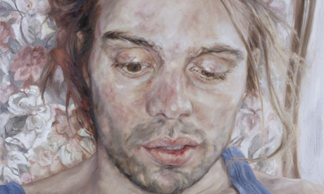
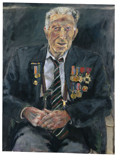
On a recent trip to the National Portrait Gallery I was able to admire the entries selected for the most prestigious portrait competition in the world. In this year's exhibition, 56 selected portraits were in for the chance of winning £25,000 as well as a launch pad into a potential career. I really liked the intimate and personal elements to those pieces surrounding family and friends.

First prize went to Changeling 2 by Peter Monkman, and even thought this is an amazing piece any of the other portraits were worthy so it must of been a tough decision. Perhaps it was the thinking behind this piece, that gave him the deciding vote. It's  part of a series of portraits of his daughter exploring the concept of the changeling, a child substituted for another by stealth, often with an elf. 

‘I challenge the fixed notion of an idealised image of childhood and substitute it for a more unsettling, complex, representation that exists in its own right as a painting.’ 

The initial ideas for this portrait came from photographic studies of his daughter playing in woods in Brittany where the light had a magical quality.


Second and third prizes went to Michael Gaskell for 'Tom' and Annalisa Avancini for 'Manuel.' The exhibition not only showcases the talent in portrait painting today but also captures the variety of styles and approaches that this entails. My favourite was 'Harry Patch' by Dan Llywelyn. 

"I want my MTV"


When pondering on memories and inspiration from childhood I came across this term coined the MTV Generation. Apparently anyone born from 1975-1988 falls into this labeling, a generation whose adolescence and coming of age is perceived to have been heavily influenced by 1990s popular culture and mass media. I have always been interested in the influence of culture and how this shapes our beliefs for the future, something we are born into...something we are  have no choice in being influenced by.

Courtesy of Wikipedia: If you were part of the MTV Generation you will remember:


  • The launch of MTV in its early period before its mid-1990s makeover for predominantly pop musicrhythm and blueship hop culture and reality television. The popular tagline: "I want my MTV"
  • Music influences stem mainly from MTV standards such as Madonna and Michael Jackson - mostly from The Like a Prayer & Dangerous years in the 1980s - but also include the rise of the Grunge music scene of the early 1990s, and the rising popularity of Hip hop and techno music through the 1980s and 1990s.
  • The second generation to mostly be influenced through Television (especially Music Television) as the primary medium for information and entertainment (the first being the baby boom generation crossing over to the early Generation X - when TV came into becoming an item in every household during the 1950s) especially from children growing up in the 1980s to their teens in the 1990s.
  • Films such as The GooniesThe Neverending Story and E.T. the Extra-Terrestrial which featured children in opposition to adults and oppressive or impersonal systems of law. 
  • TransformersThunder CatsM.A.S.K.Masters of the Universe and other toyline (franchises) centered around the primary theme of alien/high tech/supernatural combat occurring at large in a disguised form, but also containing strong modernist/morally absolutist themes which have been more recently removed in revised versions of these fictional scenarios
I'd also like to add Back To The Future, Gremlins, Ghostbusters, Home Alone 1&2 and a Sega Mega Drive II to that list :)

The MTV generation represents the revolutionary changes of the 80s and 90s and the overall feelings this created. I found it fascinating how one TV channel has been the catalyst for much of my childhood memories, that along with the changes in media, meant that the constant bombardment into living rooms was something hard not become absorbed into. It's almost like the impact of viral campaigns today.

There were for no jabs against the MTV virus.

Although I didn't really mind being infected,  the cultural references surrounding the term really re-kindled times once forgotten, I'm sure many other twenty-somethings will agree with me. 

Bart Simpson: Nothing you say can upset us. We're the MTV generation.
Lisa Simpson: We feel neither highs or lows.
Homer Simpson: Really? What's it like?
Lisa Simpson: Ehh. [shrugs]